All Products

All Products — Kids Marvels | Shop Pakistani Suits Online

:root{
–ivory:#faf6f1;–cream:#f2ebe1;–blush:#f5e4dc;
–rose:#c98474;–maroon:#5b1a2b;–plum:#3a1220;
–gold:#b48b52;–gold-l:#e6c48a;
–ink:#1c1512;–muted:#7a6a63;–line:#e7ddd2;
–shadow-sm:0 4px 14px -6px rgba(58,18,32,.18);
–shadow-md:0 20px 40px -20px rgba(58,18,32,.28);
–shadow-lg:0 40px 80px -30px rgba(58,18,32,.35);
}
*,*::before,*::after{box-sizing:border-box}
html,body{margin:0;padding:0;overflow-x:hidden}
/* Full-bleed breakouts to stretch elements edge-to-edge inside boxed Elementor sections */
body header,
body footer,
body main,
body section:not(.cta):not(.banner),
body .km-header,
body .km-footer,
body .toolbar,
body .page-head {
width: 100vw !important;
max-width: 100vw !important;
margin-left: calc(50% – 50vw) !important;
margin-right: calc(50% – 50vw) !important;
}
@supports (width: 100dvw) {
body header,
body footer,
body main,
body section:not(.cta):not(.banner),
body .km-header,
body .km-footer,
body .toolbar,
body .page-head {
width: 100dvw !important;
max-width: 100dvw !important;
margin-left: calc(50% – 50dvw) !important;
margin-right: calc(50% – 50dvw) !important;
}
}
/* Reset Elementor widget inner container padding/margin defaults */
.elementor-widget-html,
.elementor-widget-html .elementor-widget-container {
padding: 0 !important;
margin: 0 !important;
}
/* Sticky header over full-bleed */
body header {
position: sticky !important;
top: 0 !important;
z-index: 1000 !important;
background: rgba(250,246,241,.92);
}
body{font-family:’Inter’,system-ui,sans-serif;background:var(–ivory);color:var(–ink);line-height:1.65;font-size:15px;-webkit-font-smoothing:antialiased}
img{display:block;max-width:100%;height:auto}
a{color:inherit;text-decoration:none;-webkit-tap-highlight-color:transparent}
button{font-family:inherit;cursor:pointer}
h1,h2,h3,h4{font-family:’Cormorant Garamond’,serif;font-weight:500;margin:0;color:var(–plum);letter-spacing:.01em}
.container{width:100%;max-width:1280px;margin:0 auto;padding:0 20px}
@media(min-width:768px){.container{padding:0 32px}}
.eyebrow{font-size:10px;letter-spacing:.3em;text-transform:uppercase;color:var(–gold);font-weight:600}
.btn{display:inline-flex;align-items:center;justify-content:center;gap:10px;padding:14px 26px;font-size:11px;letter-spacing:.26em;text-transform:uppercase;font-weight:600;border-radius:999px;transition:all .3s;border:1px solid transparent;min-height:48px;cursor:pointer}
.btn-primary{background:var(–maroon);color:var(–ivory)}
.btn-primary:hover{background:var(–plum);transform:translateY(-1px);box-shadow:0 10px 30px -12px rgba(91,26,43,.5)}
.btn-ghost{background:transparent;color:var(–ink);border-color:var(–ink)}
.btn-ghost:hover{background:var(–ink);color:var(–ivory)}
/* ============ HOME PAGE HEADER ============ */
header {
position: sticky; top: 0; z-index: 60;
background: rgba(250, 246, 241, 0.92);
backdrop-filter: saturate(180%) blur(14px);
-webkit-backdrop-filter: saturate(180%) blur(14px);
border-bottom: 1px solid var(–line);
}
.nav {
display: grid; grid-template-columns: auto 1fr auto; align-items: center;
padding: 12px 16px; gap: 8px; max-width: 1400px; margin: 0 auto;
}
.nav-links { display: none; gap: 28px; font-size: 12px; letter-spacing: .18em; text-transform: uppercase; font-weight: 500; }
.nav-links a { position: relative; padding: 6px 0; color: var(–ink); opacity: .85; transition: opacity .3s; }
.nav-links a::after { content: “”; position: absolute; left: 0; right: 0; bottom: 0; height: 1px; background: var(–maroon); transform: scaleX(0); transform-origin: right; transition: transform .35s ease; }
.nav-links a:hover { opacity: 1; }
.nav-links a:hover::after { transform: scaleX(1); transform-origin: left; }
.brand { font-family: ‘Cormorant Garamond’, serif; font-size: 30px; font-weight: 600; letter-spacing: .02em; text-align: center; color: var(–maroon); line-height: 1; justify-self: center; }
.nav-icons { display: flex; gap: 4px; justify-content: flex-end; align-items: center; color: var(–ink); }
.icon-btn { width: 48px; height: 48px; display: inline-flex; align-items: center; justify-content: center; border-radius: 999px; transition: background .3s; background: transparent; border: 0; color: var(–maroon); cursor: pointer; }
.icon-btn:hover, .icon-btn:active { background: var(–cream); }
.icon-btn svg { width: 30px; height: 30px; stroke: currentColor; fill: none; stroke-width: 2; stroke-linecap: round; stroke-linejoin: round; }
.icon-btn.hide-mobile { display: none; }
@media(min-width: 1024px) {
.nav { grid-template-columns: 1fr auto 1fr; padding: 16px 24px; gap: 16px; }
.nav-links { display: flex; }
.brand { font-size: 36px; }
.icon-btn.hide-mobile { display: inline-flex; }
.menu-btn { display: none !important; }
.nav-icons { gap: 12px; }
}
/* ============ MOBILE DRAWER ============ */
.drawer-scrim {
position: fixed; inset: 0; background: rgba(28, 21, 18, 0.55);
opacity: 0; pointer-events: none; transition: opacity .3s; z-index: 70;
backdrop-filter: blur(4px);
}
.drawer {
position: fixed; top: 0; left: 0; bottom: 0; width: min(84vw, 340px);
background: var(–ivory); z-index: 80; transform: translateX(-100%);
transition: transform .35s cubic-bezier(.4, 0, .2, 1);
display: flex; flex-direction: column;
box-shadow: 0 0 60px rgba(0, 0, 0, .2);
}
.drawer-head { display: flex; align-items: center; justify-content: space-between; padding: 16px 20px; border-bottom: 1px solid var(–line); }
.drawer-brand { font-family: ‘Cormorant Garamond’, serif; font-size: 22px; color: var(–maroon); }
.drawer-links { display: flex; flex-direction: column; padding: 8px 0; flex: 1; overflow-y: auto; }
.drawer-links a {
padding: 16px 24px; font-size: 14px; letter-spacing: .14em; text-transform: uppercase;
font-weight: 500; color: var(–ink); border-bottom: 1px solid var(–line);
display: flex; justify-content: space-between; align-items: center;
}
.drawer-links a::after { content: “›”; color: var(–gold); font-size: 22px; font-weight: 400; }
.drawer-foot { padding: 20px 24px; border-top: 1px solid var(–line); display: flex; flex-direction: column; gap: 8px; }
.drawer-foot small { font-size: 11px; letter-spacing: .2em; text-transform: uppercase; color: var(–muted); }
body.drawer-open { overflow: hidden; }
body.drawer-open .drawer { transform: translateX(0); }
body.drawer-open .drawer-scrim { opacity: 1; pointer-events: auto; }
/* ============ PAGE CONTENT ============ */
.page-head{background:radial-gradient(700px 300px at 90% 10%,rgba(201,132,116,.22),transparent 60%),radial-gradient(500px 250px at 0% 90%,rgba(180,139,82,.14),transparent 60%),linear-gradient(180deg,var(–ivory),var(–blush));padding:56px 0 44px;text-align:center;border-bottom:1px solid var(–line)}
.crumb{font-size:11px;letter-spacing:.22em;text-transform:uppercase;color:var(–muted);margin-bottom:14px}
.crumb a{color:var(–maroon)}
.crumb span{margin:0 8px;color:var(–gold)}
.page-head h1{font-size:clamp(42px,8vw,72px);margin:0 0 14px;line-height:1.02}
.page-head h1 em{font-style:italic;color:var(–rose);font-weight:400}
.page-head p{color:var(–muted);max-width:560px;margin:0 auto;font-size:16px}
.toolbar{position:sticky;top:64px;z-index:40;background:var(–ivory);border-top:1px solid var(–line);border-bottom:1px solid var(–line);padding:12px 0}
.toolbar-inner{display:flex;gap:12px;align-items:center;justify-content:space-between;flex-wrap:wrap}
.chips{display:flex;gap:8px;overflow-x:auto;scrollbar-width:none;padding-bottom:2px;flex:1;min-width:0}
.chips::-webkit-scrollbar{display:none}
.chip{flex-shrink:0;padding:9px 18px;border-radius:999px;background:var(–ivory);border:1px solid var(–line);font-size:12px;letter-spacing:.16em;text-transform:uppercase;font-weight:600;color:var(–ink);cursor:pointer;transition:all .25s;font-family:inherit}
.chip:hover{border-color:var(–rose);color:var(–maroon)}
.chip.on{background:var(–maroon);color:var(–ivory);border-color:var(–maroon)}
.sort{display:flex;align-items:center;gap:8px;font-size:12px;letter-spacing:.16em;text-transform:uppercase;color:var(–muted)}
.sort select{border:1px solid var(–line);background:var(–ivory);padding:8px 32px 8px 12px;border-radius:8px;font-family:inherit;font-size:12px;font-weight:600;color:var(–ink);cursor:pointer;letter-spacing:.1em}
.shop{padding:36px 0 80px}
.count{font-size:12px;letter-spacing:.2em;text-transform:uppercase;color:var(–muted);margin-bottom:24px}
.count b{color:var(–maroon)}
.grid{display:grid;grid-template-columns:repeat(2,1fr);gap:16px}
@media(min-width:768px){.grid{grid-template-columns:repeat(3,1fr);gap:24px}}
@media(min-width:1200px){.grid{grid-template-columns:repeat(4,1fr);gap:28px}}
.prod{position:relative;background:var(–ivory);border-radius:12px;overflow:hidden;transition:transform .3s,box-shadow .3s;display:flex;flex-direction:column}
.prod:hover{transform:translateY(-4px);box-shadow:var(–shadow-md)}
.prod-img{position:relative;aspect-ratio:4/5;overflow:hidden;background:var(–cream)}
.prod-img img{width:100%;height:100%;object-fit:cover;object-position:top center;transform-origin:top center;transition:transform .8s ease}
.prod:hover .prod-img img{transform:scale(1.04)}
.tag{position:absolute;top:10px;left:10px;background:var(–ivory);color:var(–maroon);font-size:9px;letter-spacing:.22em;text-transform:uppercase;font-weight:700;padding:6px 10px;border-radius:999px;box-shadow:var(–shadow-sm);z-index:2}
.tag.sale{background:var(–maroon);color:var(–ivory)}
.tag.new{background:var(–gold-l);color:var(–plum)}
.wish{position:absolute;top:10px;right:10px;width:36px;height:36px;border-radius:50%;background:var(–ivory);border:0;display:inline-flex;align-items:center;justify-content:center;box-shadow:var(–shadow-sm);color:var(–maroon);z-index:2;cursor:pointer}
.wish svg{width:16px;height:16px;stroke:currentColor;fill:none;stroke-width:1.7}
.wish:hover{background:var(–maroon);color:var(–ivory)}
.prod-info{padding:14px 6px 8px}
.prod-info .cat{font-size:9px;letter-spacing:.22em;text-transform:uppercase;color:var(–gold);font-weight:600;margin-bottom:4px}
.prod-info h3{font-size:17px;line-height:1.25;margin-bottom:6px}
.price{display:flex;align-items:baseline;gap:8px;font-family:’Cormorant Garamond’,serif}
.price strong{color:var(–maroon);font-size:18px;font-weight:600}
.price del{color:var(–muted);font-size:13px}
.swatches{display:flex;gap:6px;margin-top:10px}
.swatches i{width:14px;height:14px;border-radius:50%;border:1px solid var(–line);display:inline-block}
.prod .add{margin-top:12px;width:100%;padding:11px;font-size:10px;letter-spacing:.24em;text-transform:uppercase;font-weight:700;background:transparent;border:1px solid var(–ink);border-radius:999px;color:var(–ink);cursor:pointer;transition:all .3s;font-family:inherit;opacity:0;transform:translateY(6px)}
.prod:hover .add,.prod:focus-within .add{opacity:1;transform:translateY(0)}
.prod .add:hover{background:var(–maroon);color:var(–ivory);border-color:var(–maroon)}
@media(max-width:767px){.prod .add{opacity:1;transform:none;padding:10px;font-size:9px}}
.load{text-align:center;padding:32px 0 0}
.empty{display:none;text-align:center;padding:60px 20px;color:var(–muted)}
.empty.on{display:block}
/* ============ FOOTER (from home) ============ */
footer { background: var(–ink); color: rgba(250, 246, 241, 0.82); padding: 48px 0 24px; margin: 0; }
.foot-grid { display: grid; grid-template-columns: 1fr; gap: 32px; width: 100%; padding: 0 20px; box-sizing: border-box; }
.foot-brand h3 { font-family: ‘Cormorant Garamond’, serif; font-size: 38px; font-weight: 600; color: var(–ivory); margin-bottom: 6px; letter-spacing: .01em; line-height: 1.1; }
.foot-brand h3 small { display: block; font-family: ‘Inter’, sans-serif; font-size: 11px; letter-spacing: .44em; color: var(–gold-l); margin-top: 8px; font-weight: 600; }
.foot-brand p { font-size: 13px; max-width: 340px; margin: 16px 0 20px; line-height: 1.7; }
.foot-social { display: flex; gap: 10px; }
.foot-social a {
width: 40px; height: 40px; border-radius: 999px;
border: 1px solid rgba(250, 246, 241, .2); display: flex; align-items: center; justify-content: center; transition: all .3s;
}
.foot-social a:hover { background: var(–gold-l); color: var(–plum); border-color: var(–gold-l); }
.foot-social svg { width: 16px; height: 16px; fill: none; stroke: currentColor; stroke-width: 1.6; }
.foot-col h4 { font-family: ‘Inter’, sans-serif; font-size: 11px; letter-spacing: .26em; text-transform: uppercase; color: var(–ivory); margin-bottom: 16px; font-weight: 600; }
.foot-col ul { list-style: none; padding: 0; margin: 0; display: flex; flex-direction: column; gap: 10px; }
.foot-col a { font-size: 13px; transition: color .3s; }
.foot-col a:hover { color: var(–gold-l); }
.foot-bottom {
margin: 28px 0 0; padding: 24px 20px 0;
border-top: 1px solid rgba(250, 246, 241, 0.1);
display: flex; flex-direction: column; gap: 10px;
font-size: 10px; letter-spacing: .2em; text-transform: uppercase; text-align: center;
}
@media(min-width: 640px) {
.foot-grid { grid-template-columns: 1fr 1fr; gap: 40px; padding: 0 32px; }
.foot-bottom { flex-direction: row; justify-content: space-between; text-align: left; font-size: 11px; padding: 24px 32px 0; }
}
@media(min-width: 1024px) {
footer { padding: 64px 0 24px; }
.foot-grid { grid-template-columns: 2fr 1fr 1fr 1fr; gap: 60px; padding: 0 48px; }
.foot-bottom { padding: 24px 48px 0; }
}
@media(min-width: 1440px) {
footer { padding: 72px 0 28px; }
.foot-grid { gap: 80px; padding: 0 72px; max-width: 1440px; margin-left: auto; margin-right: auto; }
.foot-bottom { padding: 28px 72px 0; max-width: 1440px; margin-left: auto; margin-right: auto; }
}
/* ============ MOBILE BOTTOM BAR (from home) ============ */
.mobile-bar {
position: fixed; left: 0; right: 0; bottom: 0; z-index: 55;
background: rgba(250, 246, 241, 0.96);
backdrop-filter: saturate(180%) blur(14px);
-webkit-backdrop-filter: saturate(180%) blur(14px);
border-top: 1px solid var(–line);
display: grid; grid-template-columns: repeat(4, 1fr);
padding: 6px 4px calc(6px + env(safe-area-inset-bottom));
}
.mobile-bar a {
display: flex; flex-direction: column; align-items: center; justify-content: center;
gap: 2px; padding: 8px 4px; color: var(–ink); font-size: 9px; letter-spacing: .14em;
text-transform: uppercase; font-weight: 600;
}
.mobile-bar svg { width: 24px; height: 24px; stroke: currentColor; fill: none; stroke-width: 1.6; stroke-linecap: round; stroke-linejoin: round; }
.mobile-bar a.active { color: var(–maroon); }
@media(max-width: 1023px) { body { padding-bottom: 64px; } }
@media(min-width: 1024px) { .mobile-bar { display: none; } body { padding-bottom: 0; } }
/* Chrome: logo brand (image) — replaces text brand */
.brand{
display:inline-flex;align-items:center;justify-content:center;justify-self:center;
line-height:1;font-size:0 !important;
}
.brand img{height:42px;width:auto;max-width:160px;display:block;object-fit:contain}
@media(min-width:1024px){
.brand img{height:50px;max-width:180px}
.nav-links{gap:12px;font-size:11px;letter-spacing:.1em;flex-wrap:wrap}
}
.icon-btn.wa-btn svg,
.icon-btn svg[fill=”currentColor”]{fill:currentColor;stroke:none;width:22px;height:22px}
.drawer-brand{display:inline-flex;align-items:center;line-height:1}
.drawer-brand img{height:34px;width:auto;max-width:130px;object-fit:contain;display:block}
.drawer-section{
padding:16px 24px 6px;font-size:10px;letter-spacing:.28em;text-transform:uppercase;
color:var(–gold);font-weight:600;
}
.drawer-section::after{content:none !important}
.drawer-links .drawer-section{border-bottom:0;display:block}
.foot-brand .foot-logo{display:inline-block;line-height:0;margin:0 0 6px}
.foot-brand .foot-logo img{
height:52px;width:auto;max-width:200px;display:block;object-fit:contain;
filter:brightness(0) invert(1);
}
.foot-brand .foot-tag{
display:block;font-family:’Inter’,system-ui,sans-serif;
font-size:11px;letter-spacing:.44em;color:var(–gold-l);
margin-top:10px;font-weight:600;text-transform:uppercase;
}
.mobile-bar a svg[fill=”currentColor”]{fill:currentColor;stroke:none}


Kids Marvels


Home›Products

All products.

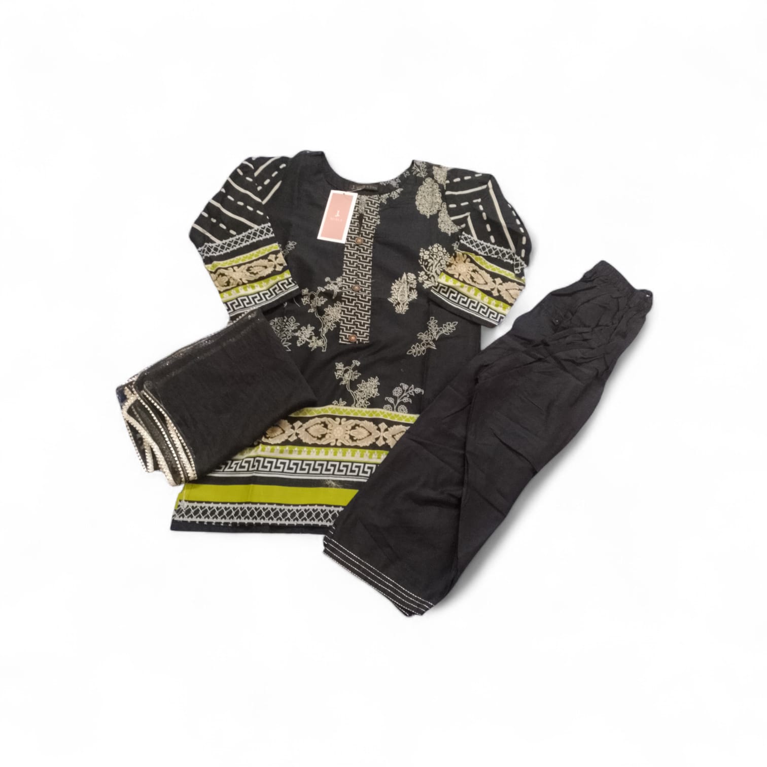
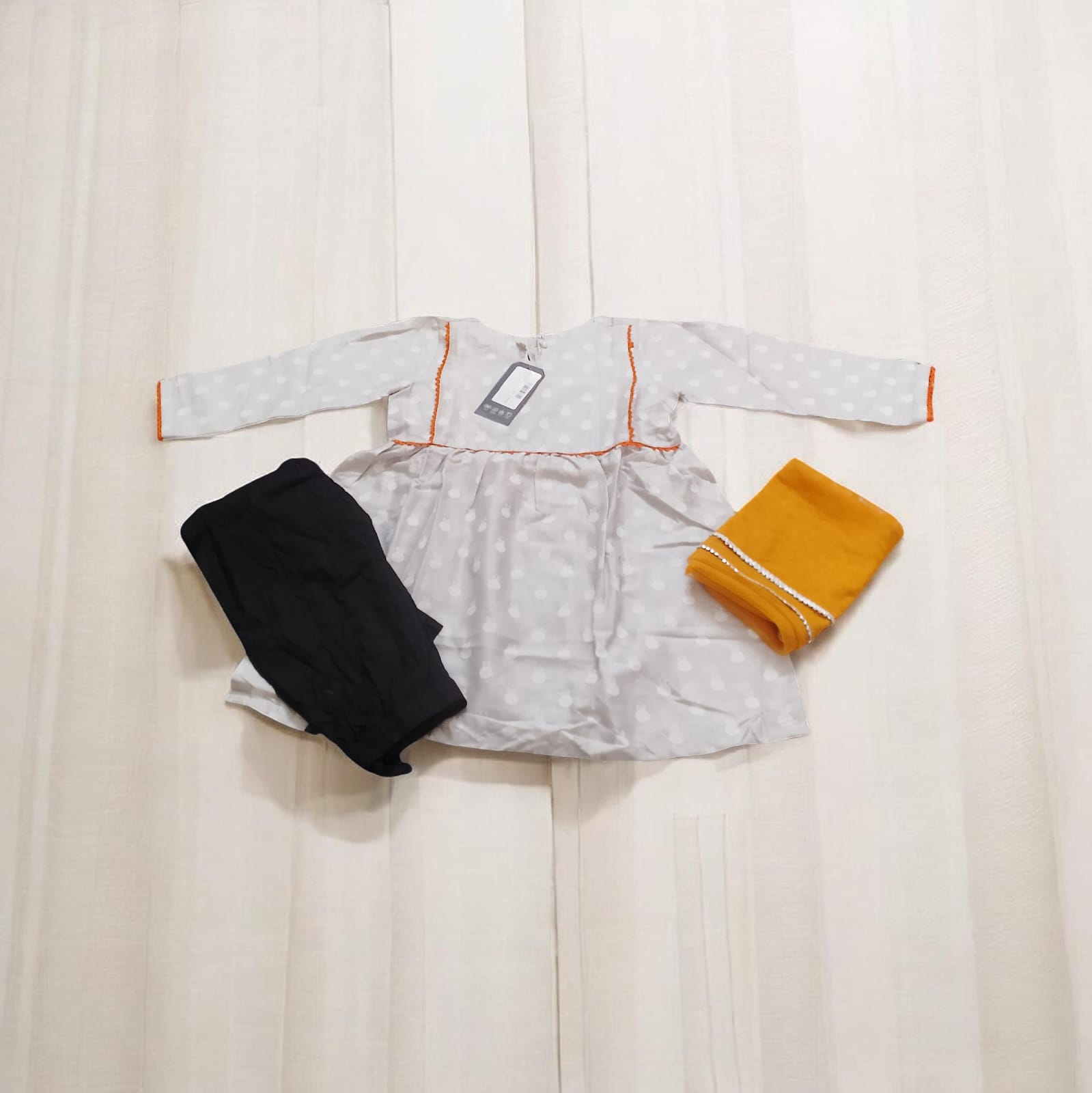
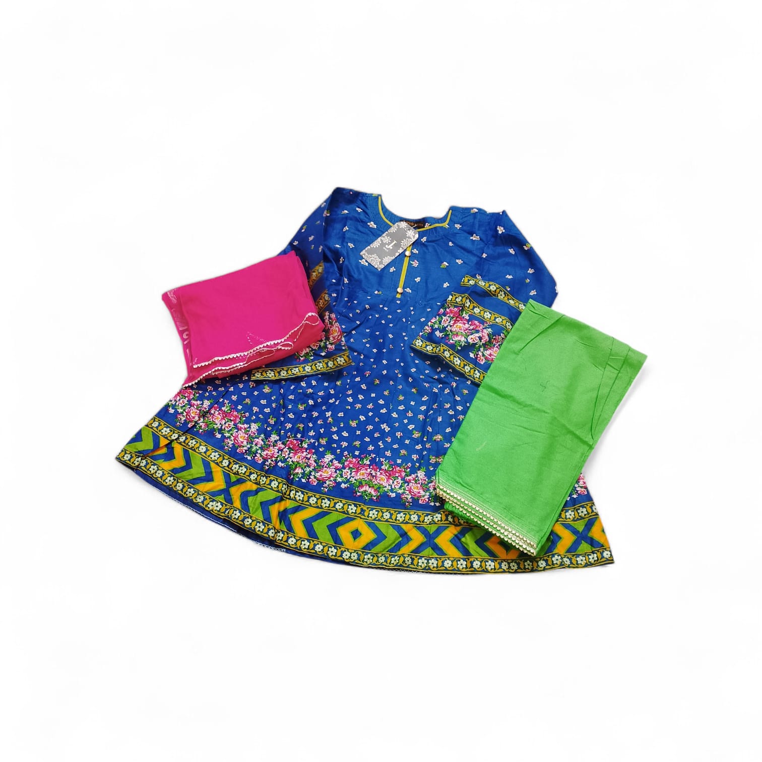
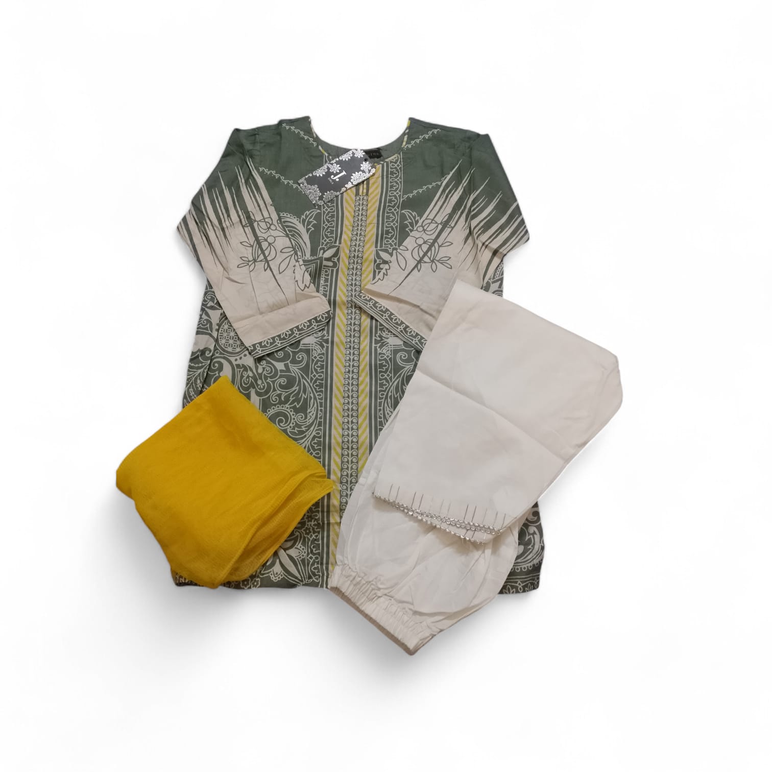
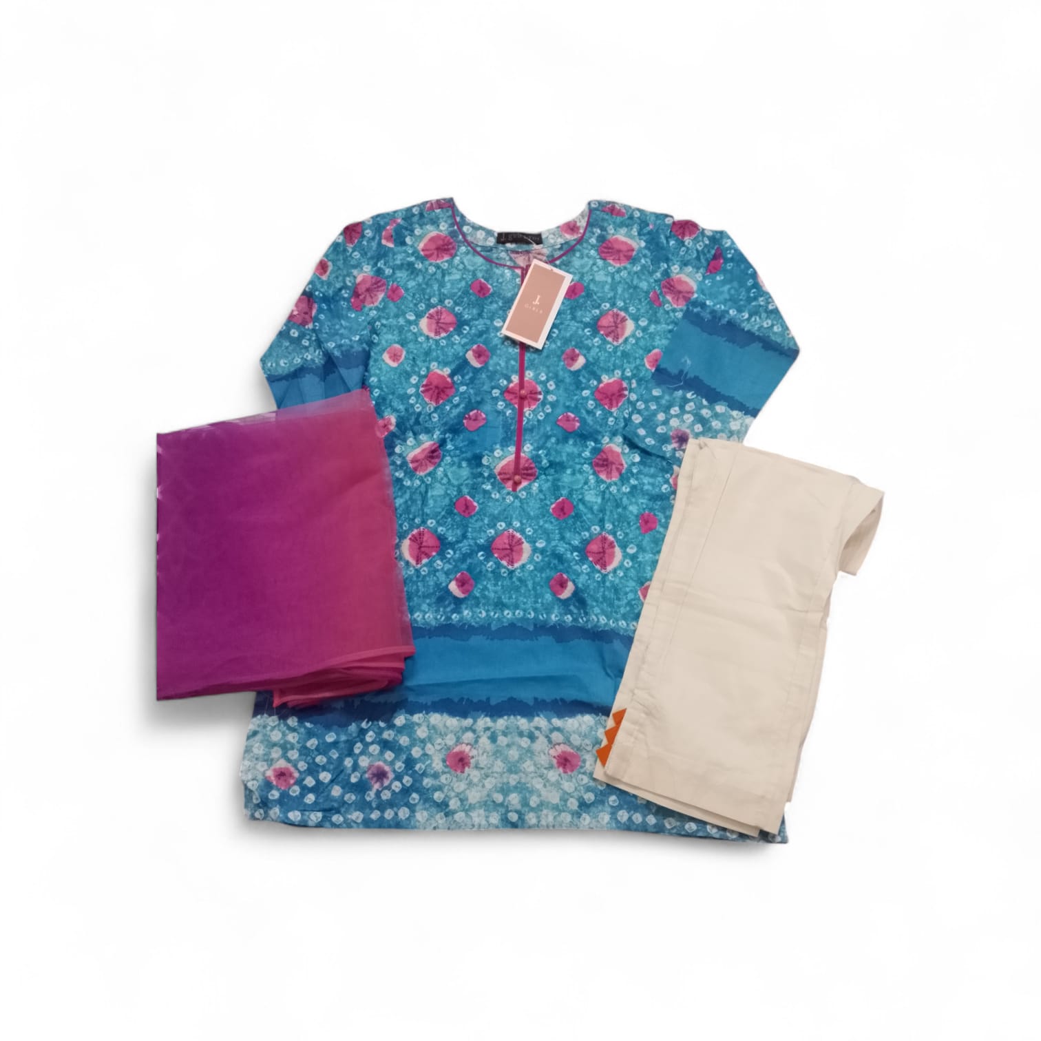
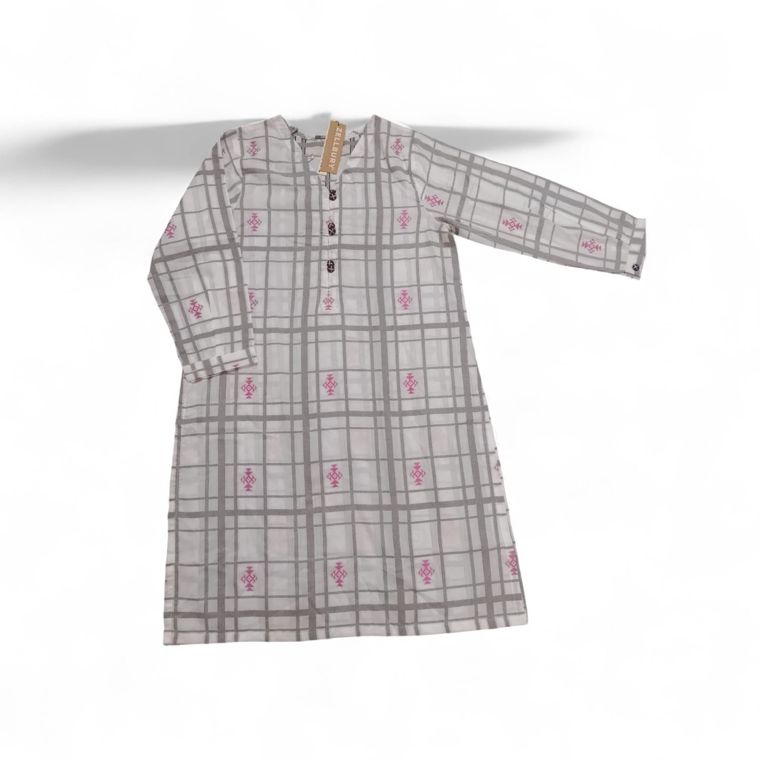
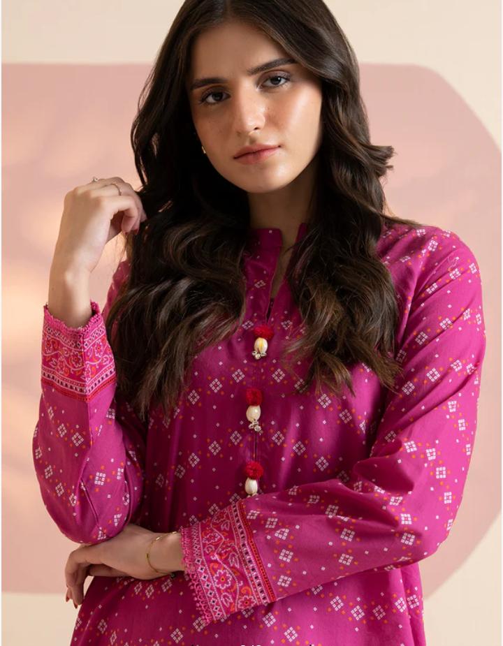
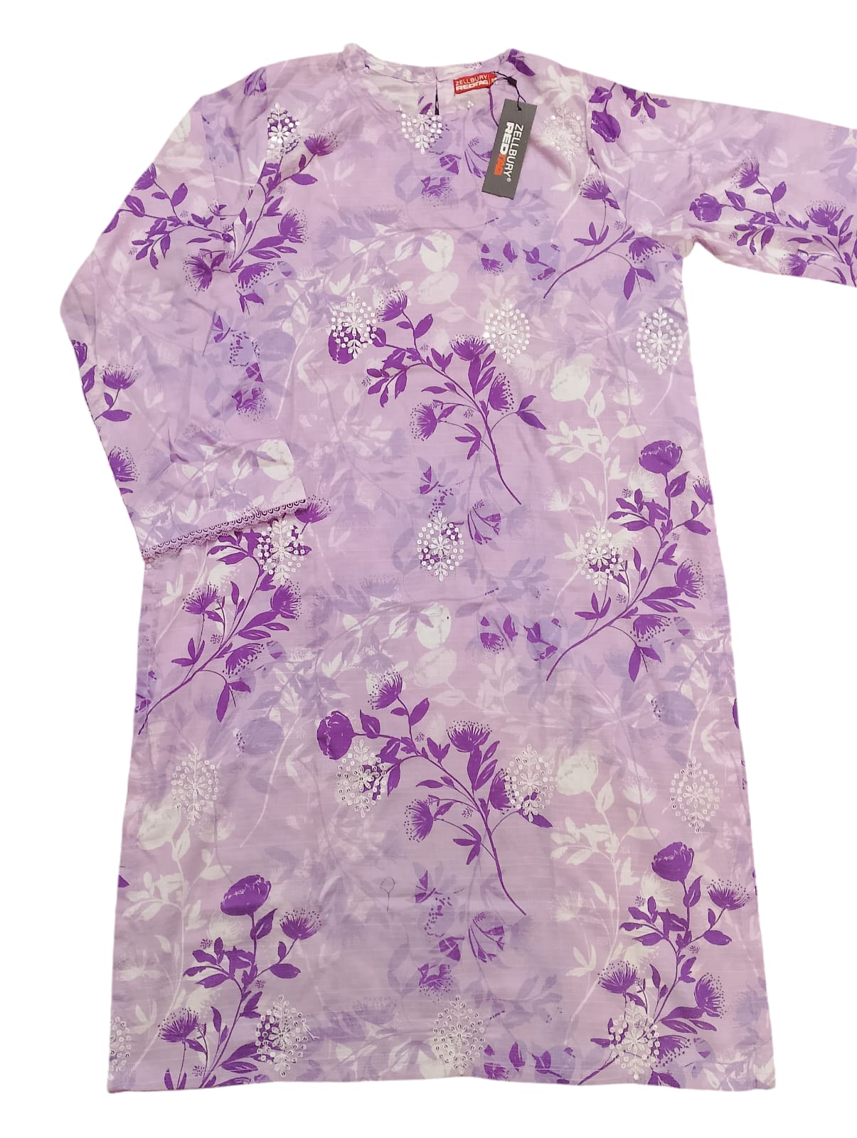
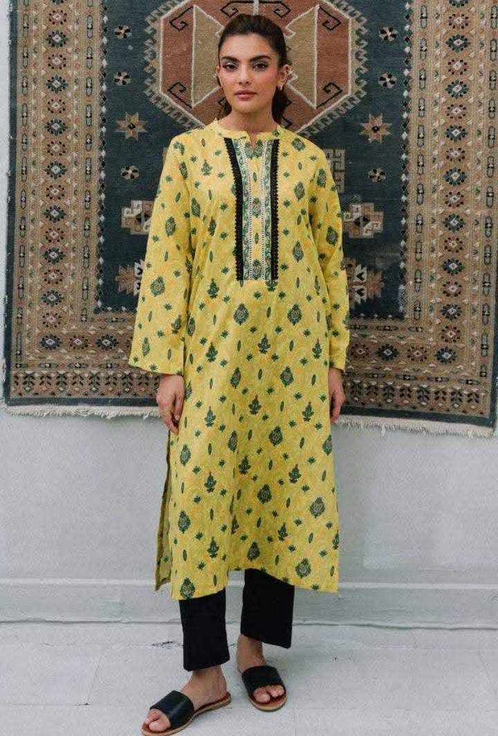
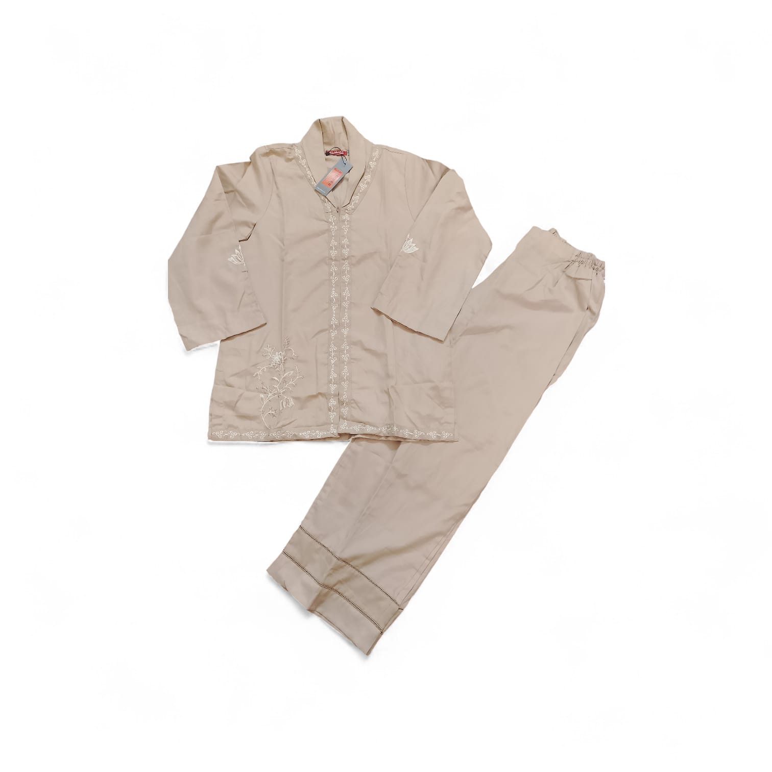
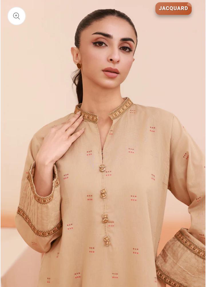
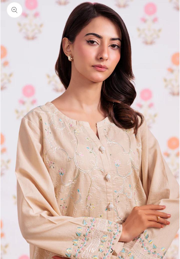
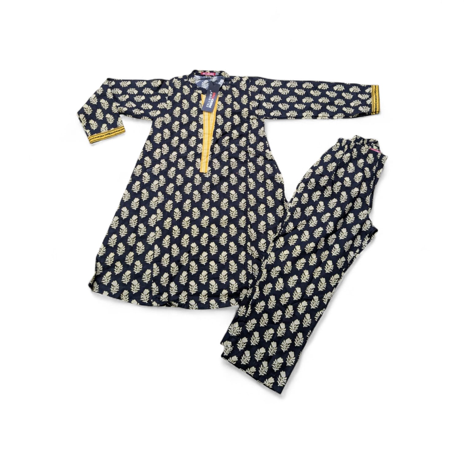
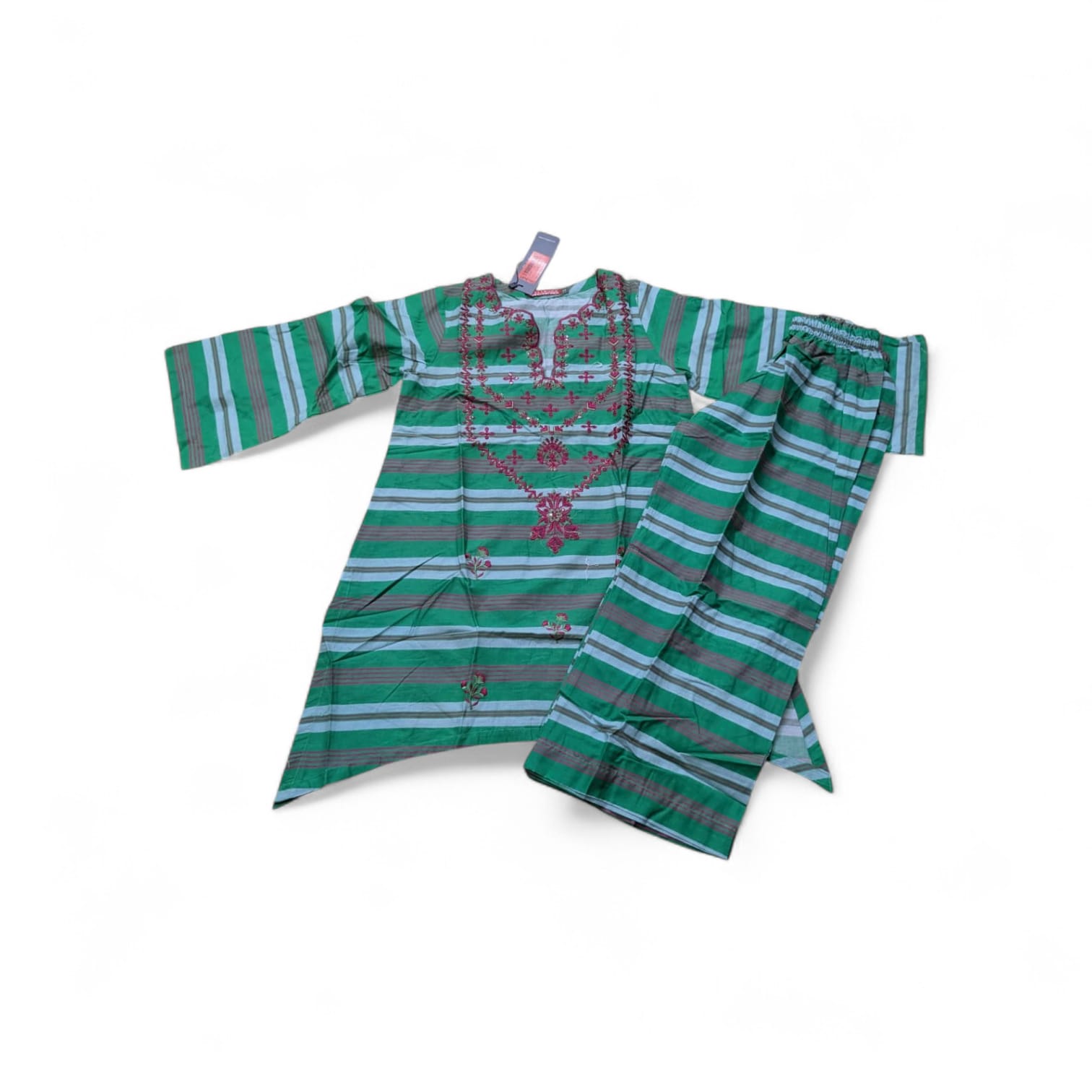
All 44 ready-to-wear kids and ladies pieces — filter by category and open any product for sizes, prices and photos.


NewestBest SellingPrice: Low → HighPrice: High → Low

Showing 44 of 44 pieces

No pieces match this filter yet — try another category.
Browse Collections


Showing 1–16 of 44 results